
Color is Back: How is it Reshaping Design?
- Jade Lyons
- Aug 20, 2025
- 4 min read
Throughout the centuries, design has expressed the culture and values of society through color. Some periods embrace brightly colored spaces, while others are more reserved. In recent years, minimalism has taken over with white walls and neutral palettes. However, a resurgence of color is breathing new life into spaces, bringing warmth, vibrancy, and personality.
So, what’s driving the colorful revolution of our day? And how is it shaping the way we create and connect?
A Look Back
Throughout history, the application of color in interiors changed with each era. Some periods embraced natural and soft hues, while others were all about bold statements. Over time, colors became more dynamic... until the 2000s when they practically vanished.
Renaissance & Baroque
Interior design gained popularity during the Renaissance. Society wanted to express its values of peace and harmony in the places where they lived. Pastels and earth tones were used since color pigments could only be sourced from nature during this time. On the other end of the color spectrum, the Baroque period was marked by dramatic expression and display of wealth, with rich reds and greens.

Georgian & Victorian
The Georgian period was dedicated to re-establishing reason and order. For interiors, this meant creating less ornate spaces with light, natural color palettes. This shifted in the Victorian period after the introduction of mass production. Since it was more affordable, interior spaces promoted showing wealth and luxury through rich colors and a return to maximalism.

Art Nouveau & Art Deco
These contrasting design styles existed within a short period of time in the early 1900s. Art Nouveau reverted to mimicking nature with earthy pastels and organic lines. In contast, Art Deco expressed luxury with rich colors and ornate geometric patterns.

Modernism & Post-Modernism
At the end of WWII, society was ready to completely re-invent the design world. Mid-century modern consisted of new shapes, patterns, muted yellows, teals, greens and browns, and clean lines. Post-modernism began as a period of excess. People were once again ready to be bold with their color palette. Vibrant colors with stark contrasts were inspired by the rise of MTV and pop culture.

The Digital Age
The world changed drastically in the 2000s with the development of the digital age. It began with a rejection once again of bold and bright colors and embraced the simple and clean look of minimalism, including neutral palettes of whites, blacks, grays, and browns.

Sustainability, Personal Expression & Post-COVID Cheer
As rapidly as technology has changed the world in recent years, so has design. Color choices have always reflected what was considered beautiful at the time, but now it's going beyond that. Sustainability is becoming an important design driver. After the COVID pandemic, the age of the all-white kitchen died as people sought to fill their spaces with life and hope again. The post-COVID mental health crisis influenced a shift toward human-centered design.
Sustainability
Awareness of global warming has led designers to keep sustainability in mind when making decisions. Timeless, warm neutrals are cultivating comfort and connection. More greenery and wood tones are being integrated into spaces to create a more natural look. Recycled materials and vintage pieces create interesting pops of color.
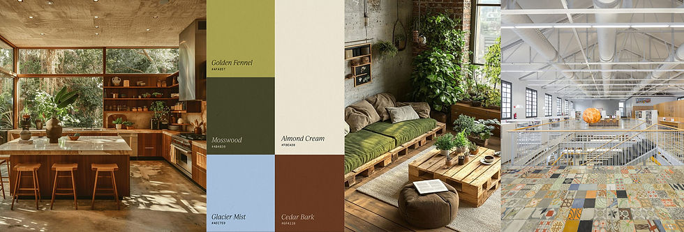
Warmth, Vibrancy & Personality
Along with sustainability, styles from other eras are being embraced with a contemporary twist. Globalization is adding even more complexity, contributing design influences from around the world. Because of so many influences, design has shifted from a traditional style or palette to more personalized styles or “eclectic” design. Spaces can feel cozy and vibrant or modern and traditional all at the same time as people create spaces that are meaningful to them.

Color Psychology & Design
A mental health crisis arose after being trapped inside during the pandemic, increasing awareness about how our environments affect our mind, body, and emotions. While design has always been focused on the latest and greatest, the value of creating spaces that support human health is becoming more important. As more research about color psychology is coming out, designers are making informed color choices with more balanced schemes. Warm neutral colors create a stable and comforting atmosphere. Blues or greens are incorporated to evoke a sense of calm, and pops of yellows or oranges promote warmth and cheerfulness.

Looking back, we can see that every era is marked by either minimalism or maximalism, soft or bold, natural or artificial. But now, with so many styles, cultures, and societal values intermixing, color choices are endless. They not only make spaces look good, but have to ability to cultivate hopefulness and inspiration, healing and warmth, or a combination of both. So, what will be next?


